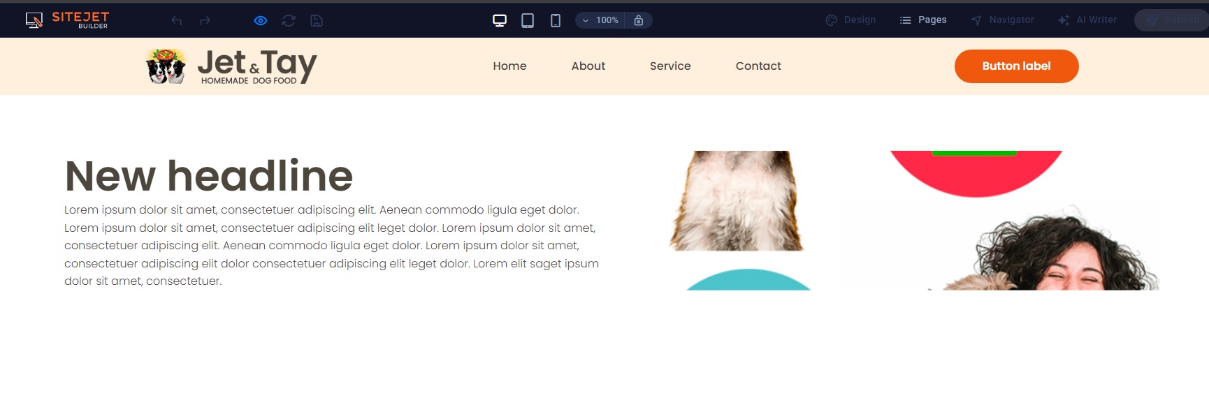
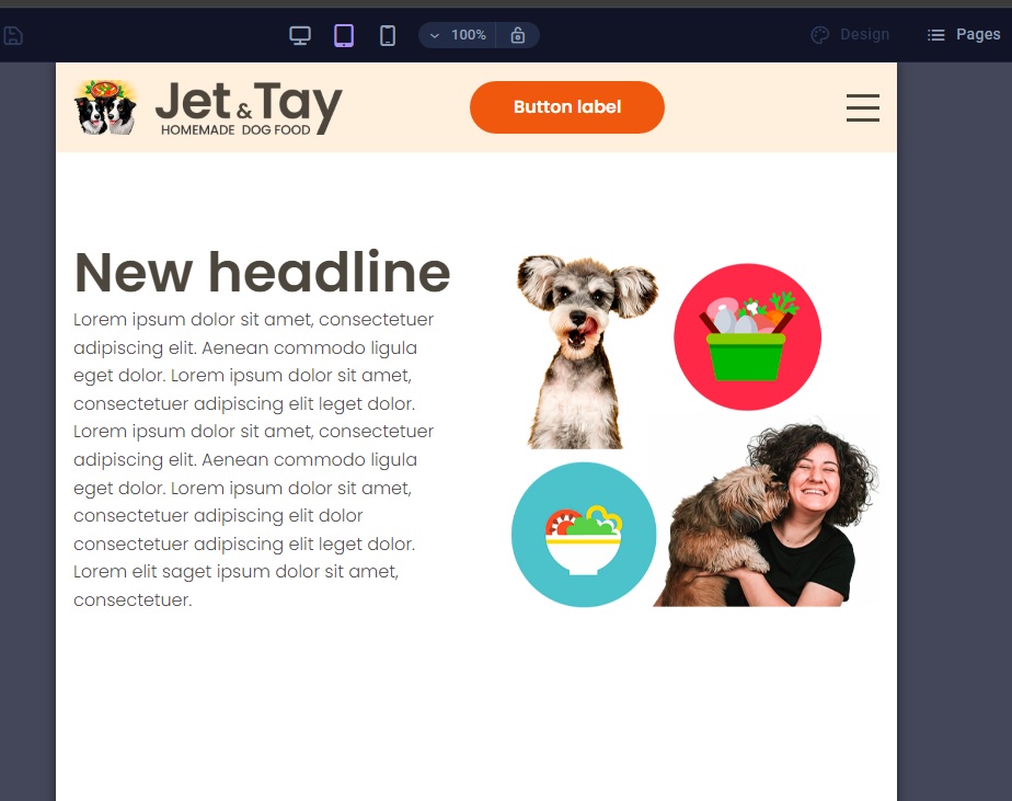
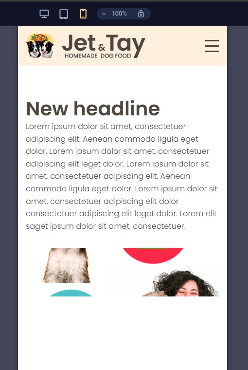
I am using a blank template. I am struggling to get the image to look correctly on all 3 modes (desktop, tablet and mobile). I have tried the preset “image with text” as well as “wide image with text”. I have changed all the settings in the containers, and tried to change the image sizes, but when it looks good on desktop, it looks bad on tablet and mobile. When it looks good on tablet, it looks bad on desktop and mobile.
Please advise on how to make this image appear full size on all 3 modes.
I tried to achieve more or less the same result as the first preset (Wide image with text) in Toyland, but without using absolute heights and widths. I don’t think it will be possible.
I did not know that the flexbox settings can also be changed for each viewport. It is difficult to know what can be changed (and what not) for each viewport, without fiddling with everything to see the behaviour.
I will play with this again over the weekend and see if I can manage to get it right.
Hey @Richard_Honey!
This behaviour is common in the Website Builder when the image element tries to keep its own proportions, so each device ends up looking different.
Here’s an easy way to make the image look full-width and consistent on desktop, tablet, and mobile:
Solution in the Sitejet Website Builder
1. Select the container/column that holds the image
Make sure you click the container around the image, not the text.
2. Change the image to “Background image”
In the right sidebar → go to Background → upload or select the image.
3. Use these background settings:
Size:Cover
Position:Center
Repeat:No-repeat
4. Set a fixed height per breakpoint (desktop / tablet / mobile)
Still in the container settings:
Desktop: ~500–650px
Tablet: ~400–500px
Mobile: ~300–400px
You can switch breakpoints at the top of the builder and set different heights for each mode.
Why this fixes the issue
Background images scale proportionally using cover, so the section always stays full-width without breaking the layout — the easiest way to keep a big image looking good on all devices in the classic Builder.
If you prefer to keep a normal image element, he would need to make the image column 100% width and remove any max-width settings, but the background method is far more reliable.
Hi Chris.
Thank you so much for your detailed response.
I have found the solution to this:
The container did not flex around the image, because it is a background image, not an image element inside the “Wide image with text” preset. I simply deleted the image from the background container and inserted it into the element container. Voilà. No need to adjust any settings, the image now displays perfectly.
I couldn’t understand why the image behaved like that, because I misunderstood the preset title, since it is named “Wide image with text”. This led me to believe that the main element inside this preset is an image element (which will flex), supplemented with a secondary container, containing a text element. This is not the case. The text element is the main element inside this preset, since the preset has a “box” setting which does not adjust the size of the box selected, but the first container inside it, which is the text container:
 Some key findings: